LinCon and SAGA, the Swedish Annual game Design Awards competition where Kaamos is competing are now one month away, and it is time to create the final components for the game!
To celebrate, I thought it would be fun to take you behind the scenes and show how the prototype is coming together, piece by piece. In this first post, we will dive into one of the most crucial parts: the cards.
Prototype vs. Final Product
When making a prototype, it is important to keep one thing in mind: it will not look like a final, professional product — and that is absolutely fine.
A prototype is all about testing: it needs to be practical, functional, and easy to use, especially during playtests. Beauty comes later. Right now, the question is: Is the game fun? Is the user interface clear? Does it work the way it should? Do the components tie in with the chosen theme?
A Year of Cards
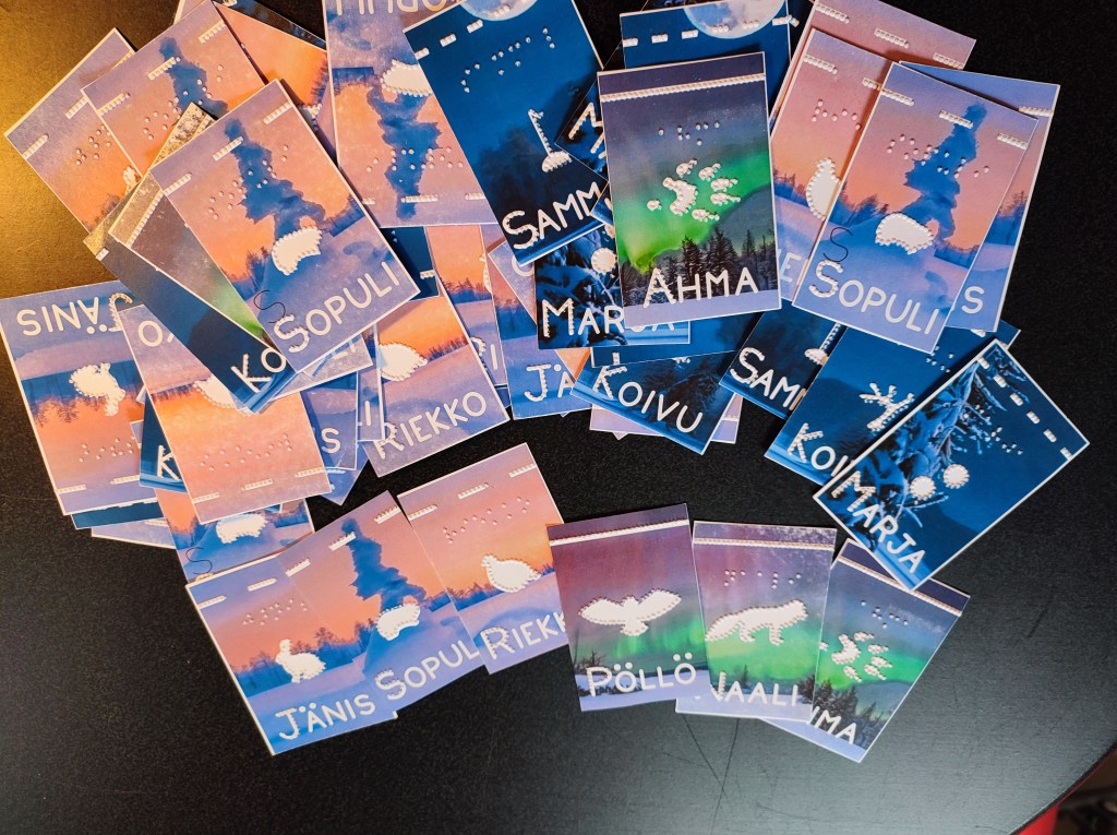
The cards for Kaamos have already lived through many versions. Some of the early ones are so worn out from playtesting that they are literally falling apart.
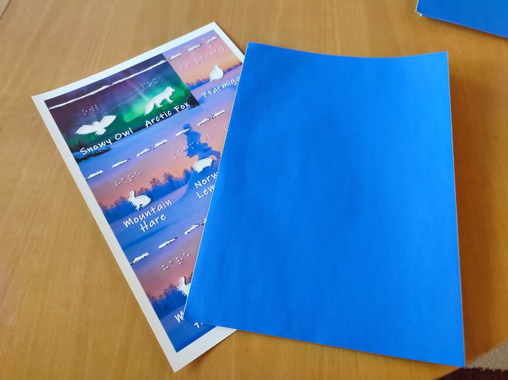
The tactile drawings were locked in months ago after careful testing and redesigning. So far, I had used 120gsm paper for the cards, which is slightly thicker than printer paper. It was great for quick edits, yet sturdy enough to ”keep the dots” even after intensive manipulations by experienced and less experienced users (no, pushing harder won’t make the dots easier to feel!).
For this final prototype, I wanted something stronger and easier to handle, especially since the cards will once again go through a lot of hands at the convention.
The Production Process
It all starts at the computer. I created the cards in Inkscape, working with several layers: the background, the image layer, the embossing elements, and the cut lines. Having everything separated makes it much easier later on when I have to save each layer in a different format.

When the design is ready, I first print the backgrounds, silhouettes and text onto 250gsm paper with a laser printer. Thicker than regular paper, but still flexible enough for cards.

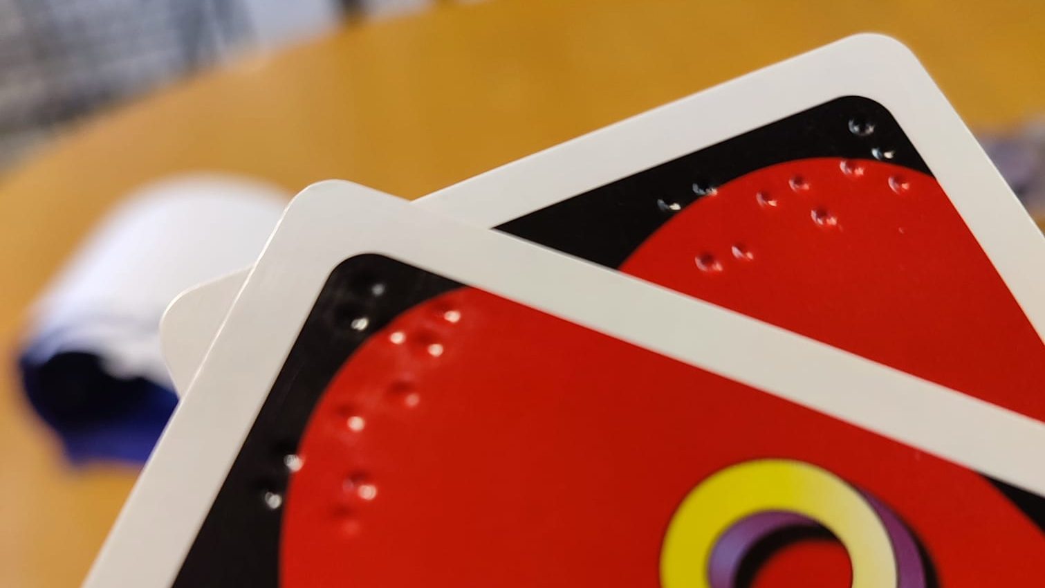
Then comes the fun (and sometimes frustrating!) part: embossing.
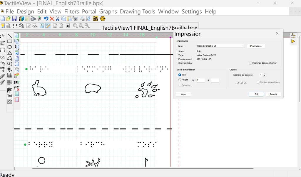
I use TactileView software to turn the embossing layer into raised dots, and an Index Everest DV5 embosser to bring them to life.
It took a lot of trial and error to get the embossing exactly where I wanted it — adjusting the designs millimeter by millimeter to line up perfectly with the printed cards.
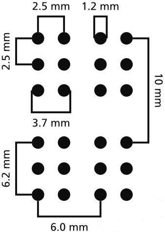
This is also where I add the Braille text. Fun fact: you cannot just shrink or stretch Braille! It has very strict size standards to stay readable.
To make it fit, I chose to shorten some names: in English for instance, I only brailled ”hare” instead of ”mountain hare,” and in Swedish, I skipped all the ”fjäll” prefixes.
Making the Cards Sturdier
Before cutting the cards out, I added a layer of sticker paper to the back of each sheet.
This protects the embossed dots from tearing the paper, especially in the places where the dots are close together like the raised top lines differentiating the 3 card categories, predator, prey or plant. As a bonus, this also hides the tactile patterns from the back, making it harder for sighted players to accidentally ”peek” at the reverse side and guess your cards.
When tactile cards like braille UNO or braille playing cards are professionally produced, embossing is done directly onto the special cardstock used for playing cards. This means that the dots can technically be seen from the reverse side. This can be mitigated by using intricate patterns/color changes on the back of the cards for instance.
Cutting the Cards
Finally, I cut the cards with a Cricut machine. Like everything else, that also took a few rounds of adjusting to make sure the cuts were aligned with the artwork and embossing.
After many, many tests, the results came together beautifully.

Ready for LinCon!
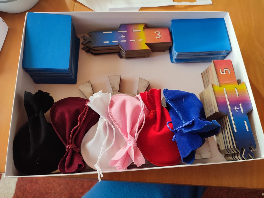
The final count? 108 cards in English and 108 cards in Swedish — ready for players to explore the world of Kaamos through touch and sight.
In the next posts, I will show you how the playing board and scoring tiles were created , how I chose the point tokens, and share more behind-the-scenes photos from the process. Stay tuned!


Jätä kommentti