When creating board games, my goal is of course to make them accessible to blind and visually impaired people, but also to challenge others to have a taste of what it is like to rely on other senses. So, for the trivia game, I might well end up creating a game without any drop of ink.
from Ink to Tactile
Although braille comes directly to the mind when talking about raised letters, this is not my goal. In fact, far from every visually impaired can read braille. Learning braille as an adult can be very challenging, and the growing use of audio and screen reading programmes does not particularly entice the learning of a new, complicated skill. Recognizing the ”usual” Latin script letters by touch though can be very fun and does not require any additional knowledge.
At first, I needed to check how various fonts end up looking when embossed in raised dots instead of printing with ink. I chose a couple of easy to read fonts, created my files in TactileView, and printed them both with ink and with raised dots.
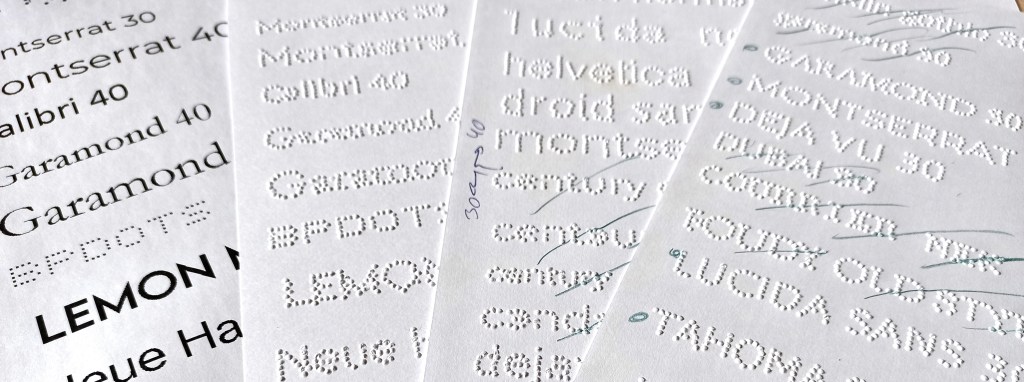
A couple fo things got obvious from the very start. First, readable on paper does not always translate well in dots. Secondly, any font below a size 35 is nearly impossible to check with your fingers. Also, capital letters are much more recognisable.
With all this in mind, I continued my search for the ”perfect embossable font”. Page after page, I did not quite find what I wanted. Some letters in some fonts were nice, but others were not, the letters were too close, they printed irregularly on different lines,…
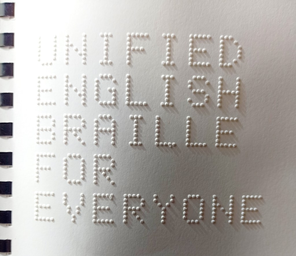
I then remembered a neat embossed latin font in my Unified English Braille for Everyone copy (available at the Braille superstore), and went on a mission to identify said font. As it is embossed, scanning it and using the usual reverse font search engines was not very successfull, but after some research, I finally managed to find a very similar font; BPdots (https://www.fontsquirrel.com/fonts/BPdots).
This font, however, did not work as well as I had hoped for my purpose. It is calibrated to be embossed at a precise size, which is, as you can see on the picture, quite large: each letter is 15 mm high and between 6 and 10 mm wide. Finnish words are quite long, so managing even one word on a single line was already a challenge!
Creating a New Font
If something doesn’t exist, I try to create it. I have some background in editing, so typographic jargon is not unknown to me. I decided to take up the challenge and start my own font that could translate exactly as I wished into raised dots.
After running some tests with both sighted and visual impaired people, I came up with the following criteria:
- I want to use all caps
- the font needs to have 7 or 8 dots in height to be readable for untrained people, but I still want to keep it at max 10 mm high
- I need extra spacing between letters compared to a normal font
With all this in mind, I was off to searching for a free, easy to use program allowing me to create my first font. FontForge (https://fontforge.org) looked like it would do the job, and after some reading and a couple of youtube tutorials, the actual design process started.
I decided to design the font directly with dots too, as this gives mme more control on how the dots will be embossed compared to plain lines, which the embosser interprets itself, leading to discrepancies between lines depending on the alignments.

With some trials and errors, the font project is now evolving very nicely towards my goal. At this stage, although not perfect by far, it really starts to come to life under the fingertips.
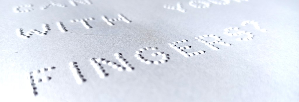
For those of you wondering why raised latin script is not commonly used for blind people instead of braille, check the text size on the photo: it took nearly half an A4 page to write ”can you read with your fingers?” in a script that can be read by touch, it takes a bit more that a line to write it in braille grade 1 (this is braille where one braille cell equals one character), and it only takes a fraction of a line to write it in Unified English Braille, a form of contracted braille used to shorten text and add speed to reading.


Jätä kommentti switchrooms Peruuta vastaus