
Two weeks have passed since the SAGA finale. Kaamos didn’t take home the Feather Trophy, but it did receive a lot of praise and positive feedback. One remark kept popping up: “Your game was the prettiest on the table!”, which feels delightfully ironic for a game designed primarily for fingers, not eyes.
Only one player dared to try the game blindfolded, though several told me they’d considered it. That moment reminded me how vulnerable it can feel to give up sight, even temporarily, especially in a noisy room full of people. Still, awareness grows step by step, and every small gesture is a win on the path to greater understanding.

On the opposite end of the perception spectrum, one comment caught me completely off guard: a player was concerned that the Braille on the cards might make sleeving difficult. For the uninitiated, sleeving means putting cards into transparent plastic pouches to protect them from wear and tear. And yes: putting Braille in a plastic pouch definitely defeats the point!
Tactile Categorization Through Size
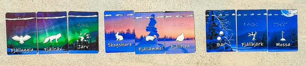
From the beginning, I knew I wanted to work with a limited set of cards. Since the game takes place during the polar night, the number of active species to choose from was limited anyway. I settled on nine different cards, grouped evenly into three predators, three preys, and three plants. To make these categories immediately identifiable by touch, I designed each group with a distinct image size:
- Predators: raised illustrations measuring 2 × 4 cm
- Prey: 2 × 2 cm
- Plants: 1 × 2 cm
The larger the threat, the larger the image, this allowed players to determine the type of card with a single swipe of the finger, without having to actually identify the species themselves.
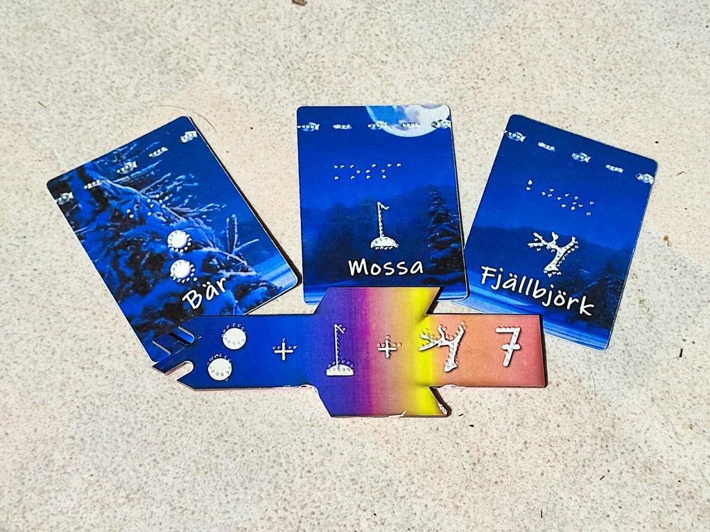
Navigating a Hand of Cards
Even with size differences, I needed a way for players to recognize the card types when holding several cards in hand at once. My first idea was to place tactile markings in the corners, as often seen in traditional cards. But through testing, I found that these markings were too small to be reliably distinguished by touch, unless using a braille symbol, and having trained fingertips.
Instead, I decided to utilize the entire top edge of the cards, where the finger naturally rests while fanning or handling a hand. These markings are easy to find and read:
- Predators: a continuous raised line
- Prey: three short lines
- Plants: five short lines
This solution proved both intuitive and accessible, and eventually, these top-line markings became the symbol system used on the scoring tiles as well.

Finding the Right Font
With the images and card markings sorted, I turned my attention to how best to display the points awarded for each scoring tile. I quickly ruled out using only Braille, as not all visually impaired people read it, nor can most sighted people either.
Instead, I decided to use raised numbers made of dots. To make that work, I tested over 50 different fonts in various sizes, only to realize that the embossing software I use, TactileView, wasn’t producing smooth or reliable results. The program tries to interpret shapes as best it can, placing dots where it sees fit — but that often meant warped lines and curves that were hard to read by touch.


So, I added another tool to my workflow: FontForge. I started designing a custom font directly in dots, minimizing the room for interpretation. Once I had a working version, I began refining: how small could I go while keeping it legible? How big could I go without turning the tiles into dinner plates? It took a lot of testing and a mountain of embossed paper, but I finally reached a version I was proud of. Huge thanks to everyone who helped test the early drafts!
Blind from Birth
Nice raised pictures and smooth number markings go a long way for many blind and low-vision players. But for some, it is still not enough. If you have never seen before, what does a picture even mean? How do you connect a shape under your fingers to a specific word or idea?
That is where striking physical characteristics become essential. What makes a hare a hare? The long ears. What is distinctive about a ptarmigan? Its round, ball-like shape. And what about the lemming? Not much, really, no notable ears, no tail you can feel,… just a small, potato-shaped creature.
For players without a visual reference, these things must be described. That’s why the Braille rulebook ended up significantly longer than the standard one. Writing it made me reflect more deeply on how to communicate the game through words alone. In fact, it even led to a last-minute design tweak: while describing the hare and the ptarmigan, I realized both were facing the same way on the card. To avoid confusion, I flipped one around, so their heads would be on opposite sides: an easy tactile cue for players to distinguish them.
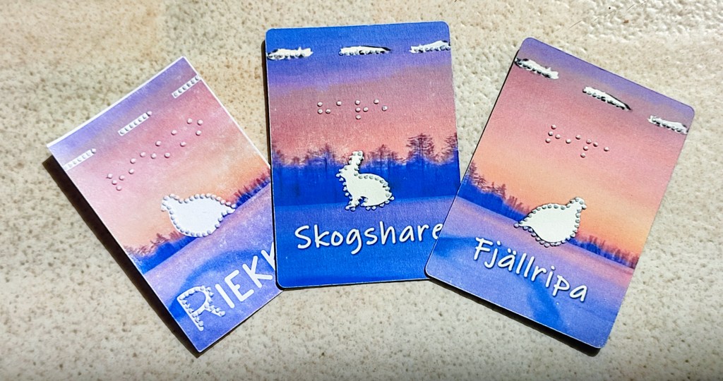
Here is an excerpt from the Braille rulebook:
- the owl is represented with open wings,
- the hare is in a sitting position, facing left, with its ears upwards,
- the ptarmigan is roundish in shape with its head to the right and its little tail to the left.
- the lemming is potato shaped without any distinctive features.
Designing towards Inclusivity
Designing an accessible game and making a game accessible are two very different things. For an accessible game, the main question is ”what”: what mechanics can work, what components can be made accessible, what are the things to avoid. For making a game accessible, the main question is ”how”: how can I adapt existing components and mechanics, how can I modify the gameplay to be more accessible?

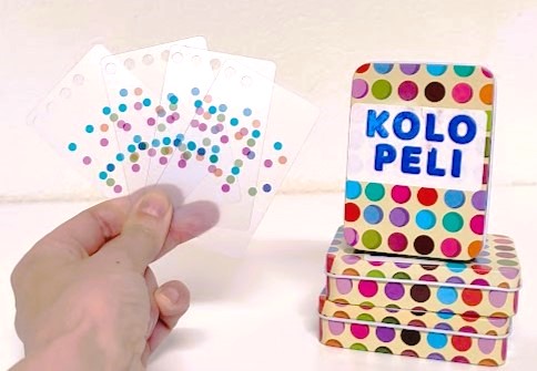

TuntoTan and KoloPeli are both games made accessible; while SokkoTuristi, JouluTunne and Kaamos were designed specifically with low vision/blindness in mind
I enjoy both approaches, and I am genuinely heartened to see more and more designers thinking about accessibility as part of their creative process. No game will ever be accessible to everyone. But when even a fraction of players find themselves included and able to join in, that is already a meaningful win.
To all designers considering accessibility, in any form or at any stage: thank you!

Jätä kommentti Katjuska Peruuta vastaus